|
|
|
|
| Re: Keshire keyblade [message #24676 is a reply to message #24653] |
Mon, 20 August 2007 08:17   |
 |
Satan
Messages: 1033
Registered: September 2005
Location: Hades
|
Administrator
|
|
|
| Bluetooth wrote: |
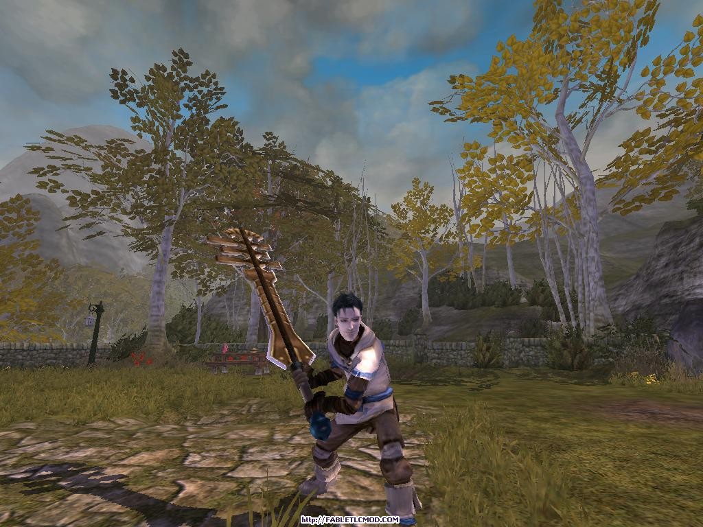
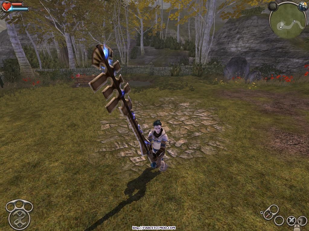
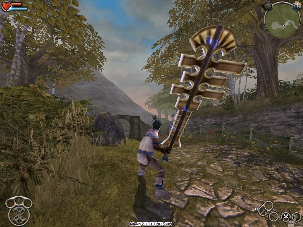
It may need to be scaled a tad. Wink
|
I think you'll find he knows about the size issue.

There is nothing in the Void.
There is no point to it's being.
I wish there was a reason.
There is nothing in the Void,
But what we put there.
[Updated on: Mon, 20 August 2007 08:17] Report message to a moderator |
|
|
|
|
|
|
|
|
|
|
|
| Re: Keshire keyblade [message #24720 is a reply to message #24718] |
Mon, 20 August 2007 20:14   |
 crazybunny
Messages: 173
Registered: July 2007
|
|
|
|
| groo wrote on Mon, 20 August 2007 19:57 |
yes, i know, this may be in the wrong section entirely, but Blue, how exactly do u make the edges of swords look sharp? or could u point me to an easy tutorial?
|
in 3ds max, you make the mesh 2 segments, you choose a face and outline it, making say for example, the bottom further than the top, making it look sharp
|
|
|
|
|
|
|
|
|
|
|
|
|
|
|
|
| Re: Keshire keyblade [message #56483 is a reply to message #56480] |
Fri, 19 March 2010 14:09   |
 |
 JohnDoe
Messages: 3007
Registered: October 2007
|
Retired
|
|
|
| plopk45 wrote on Fri, 19 March 2010 15:16 |
would it be possible to add the blue hand guard back into the keyblade....looks cooler in my opinion...
|
Keshire was opposed to handguards in Fable because sizing them appropriately so that the Hero's hands could fit in them would mean making the weapon itself look stupid, or alternatively making the handguard look stylish but making the Hero's hands clip with them which obscures or completely hides the handguard in the first place so you might as well not put them there to begin with.
And I must say that I agree with him on that.
[Updated on: Fri, 19 March 2010 14:09] Report message to a moderator |
|
|
|
|
|
|
|
 ]
]  Fable: The Lost Chapters Mod Scene
 Members
 Search
 Help
Help Register
 Login
Login Home
Home


 image, by plopk45